Making a Skincare Store Easier to Shop
Reviewed the path from homepage to product page, found five places where shoppers could lose confidence, and turned them into a clear seven-step fix list.
Project overview
Making a Skincare Store Easier to Shop overview
A short overview of the problem, solution, and result.
Starting Point
An online skincare store owner wanted to know what might be stopping more visitors from buying.What Shipped
Shipped a report website with 5 findings, 7 fixes in order, 4 screenshot examples, 13 source links, and 11 questions for a second review using the store's real numbers.Why It Mattered
Turned a broad request to improve sales into a concrete explanation of where shoppers could get stuck and what the owner should fix first.Summary
An online skincare store owner wanted to know what might be stopping more visitors from buying.
I reviewed the public store from a shopper’s point of view, found the moments where choosing or buying became harder, and turned them into a report with clear next steps. The recommendations have not yet been implemented, so this case study does not claim a sales increase.
The situation
The store sells premium botanical oils. That gives the brand a strong story, but it also asks shoppers to understand unfamiliar ingredient names before they can choose the right product.
The central question was simple: does the store help a new visitor decide what fits their needs, trust the product, and feel ready to buy?
Constraints
Use public information only.
I did not have the store’s private dashboard, sales reports, customer information, or website admin access. The first review had to stand on what a shopper could see and experience.
Do not change the live store during the review.
The report needed to explain each problem clearly enough for the owner or website team to act on later, without testing changes on real customers first.
Separate visible problems from business results.
A public review can show where shopping becomes confusing or slow. It cannot prove how much revenue a fix will create without store data and a before-and-after test.
What the report covered
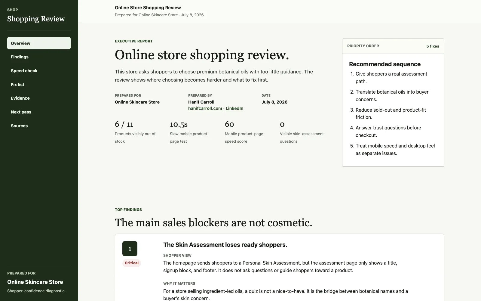
The report leads with the five most important findings, the order I would fix them, and the numbers behind the recommendations.
What I reviewed
The full shopping path.
I followed the route from the homepage to the skin assessment, product list, and a representative product page. This showed how one confusing step affected the next one.
Choice and availability.
Six of the 11 visible products were out of stock. The products were also presented mainly by botanical name, leaving shoppers to work out which oil matched concerns such as dryness, sensitivity, glow, or hair care.
Desktop and mobile pages.
The same 18 public pages were captured on desktop and mobile, with no failed pages. The report keeps the four clearest screenshots instead of making the owner work through a wall of evidence.
Page speed where buying happens.
The homepage and one product page scored 91 and 90 on desktop, but 63 and 60 on mobile. In the slower mobile product-page check, the page took about 10.5 seconds to become ready to use.
What the review found
The skin assessment led shoppers to a dead end.
The homepage promoted a personal skin assessment, but the destination showed no assessment questions and did not guide visitors toward a product. That became the first fix.
Shoppers needed help choosing by concern.
Botanical names can support the brand story, but they do not tell a new shopper which product fits their needs. The report recommends clearer product labels and filters based on the problems shoppers are trying to solve.
Sold-out products made the store feel unavailable.
With more than half of the visible products out of stock, shoppers could run into repeated dead ends. The report recommends moving unavailable items down, collecting restock requests, and pointing people to available alternatives.
Product pages asked for the purchase before earning confidence.
The buying area appeared before quick answers about who the product was for, how to use it, why to trust it, shipping and returns, or how it compared with another oil.
Mobile speed deserved its own fix.
Desktop and mobile told different stories. The report treats mobile images, store add-ons, and page speed as a separate workstream because that is where the slower checks appeared.
What the owner received
A full report and a shorter summary.
The report website contains the findings, speed checks, fix list, screenshots, follow-up questions, and sources. A shorter summary page is generated from the same content so the two versions stay consistent.
Seven fixes in a practical order.
The list starts with the skin assessment and sold-out products, then moves to product finding, product-page confidence, mobile speed, educational content, and accurate product information in search results.
A clear way to judge the work later.
Each fix includes a result to watch, such as assessment completion, product-page visits, add-to-cart rate, checkout starts, email signups, or mobile sales.
The questions needed for a deeper second pass.
The report asks for 11 groups of store data, including sales steps, devices, traffic sources, searches, inventory history, abandoned checkouts, reviews, email performance, and real-user speed data.
What the owner can use
The useful result is not a list of vague advice. It is a shared view of where shoppers get stuck, which fixes come first, and what numbers should show whether those fixes worked.
Store walk-through
I followed the same path a shopper would.
The review moved from the homepage to the skin assessment, product list, and product page instead of judging each screen in isolation.
Desktop and mobile
The same 18 public pages were checked on both devices.
All 36 page captures completed successfully. The final report uses the four clearest examples to show where shoppers could get stuck.
Main findings
Five problems made choosing and buying harder.
The report covers the empty skin assessment, unclear product fit, sold-out inventory, unanswered product questions, and mobile speed.
Fix order
The findings became seven steps in a clear order.
Each step explains what to change and what result the owner should watch afterward.
Next pass
The report names the store data needed next.
An 11-item request covers sales, devices, traffic, searches, inventory, abandoned checkouts, reviews, email, and real-user speed data.
Deliverables
Report website.
A focused report with five findings, seven fixes in order, four screenshot examples, speed results, 13 source links, and 11 questions for the next review.
Executive summary.
A shorter page generated from the same content for a quick read without maintaining a second set of recommendations.
Reusable evidence.
Desktop and mobile captures, clear stock counts, repeatable speed checks, and cited research keep the recommendations tied to something the owner can inspect again.
What could be added later
The next useful update depends on what happens after the owner reviews the report.
Add the owner’s approved feedback, any fixes made from the report, and before-and-after numbers from the store once there is enough data to judge the result.
Find what's slowing your operations down.
A Business Systems Audit maps the workflow, identifies where the process gets stuck, and gives you a first build plan.